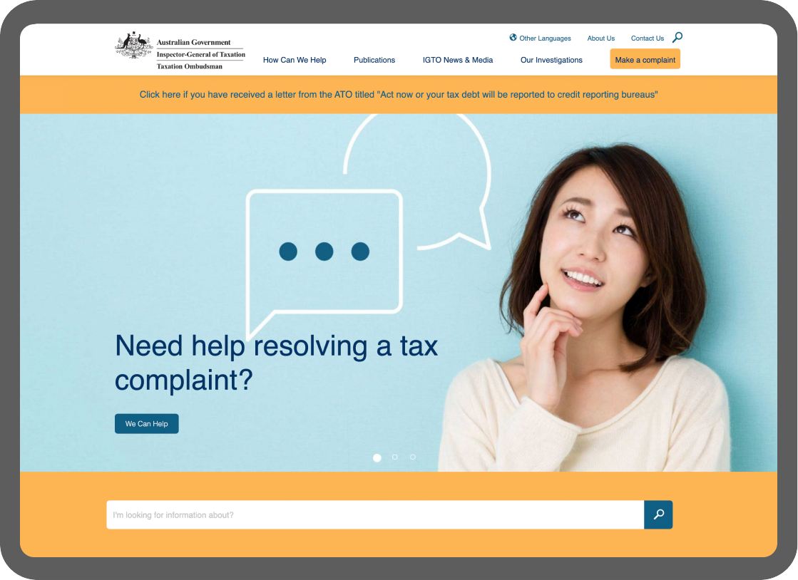
Helping navigate and resolve tax complaints
Challenge
IGTO aims to assist Australians with tax related issues navigate the complex system and assist in resolving their complaints in a positive manner. The existing website was not reflective of the excellent service that IGTO provide or easy to use for users to self serve via the rich database of reports and documents.
IGTO engaged Collier to improve the website to assist various stakeholders better navigate the site and deliver on the department’s mission to improve the administration of tax law was a priority.
Overall, the aim was to make it easier for users to find the content they are seeking, understand where they are in the site and navigate around different areas with ease.
Idea
Present the IGTO as a friendly, helpful and resolutions-focused organisation and deliver a significant UX improvement to aid users in finding content, documents and complaint processes that are relevant to their needs.
In particular, there were four key functions the new site aimed to deliver on:
- Assisting the community in understanding their ability and the process to make a taxation complaint about the ATO or TPB
- Hosting historical information such as investigations, reviews and reports for taxpayers, agencies or the community in general to reference as required
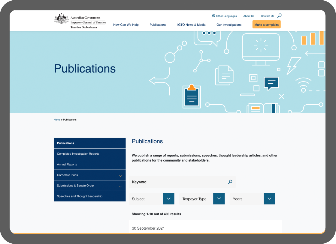
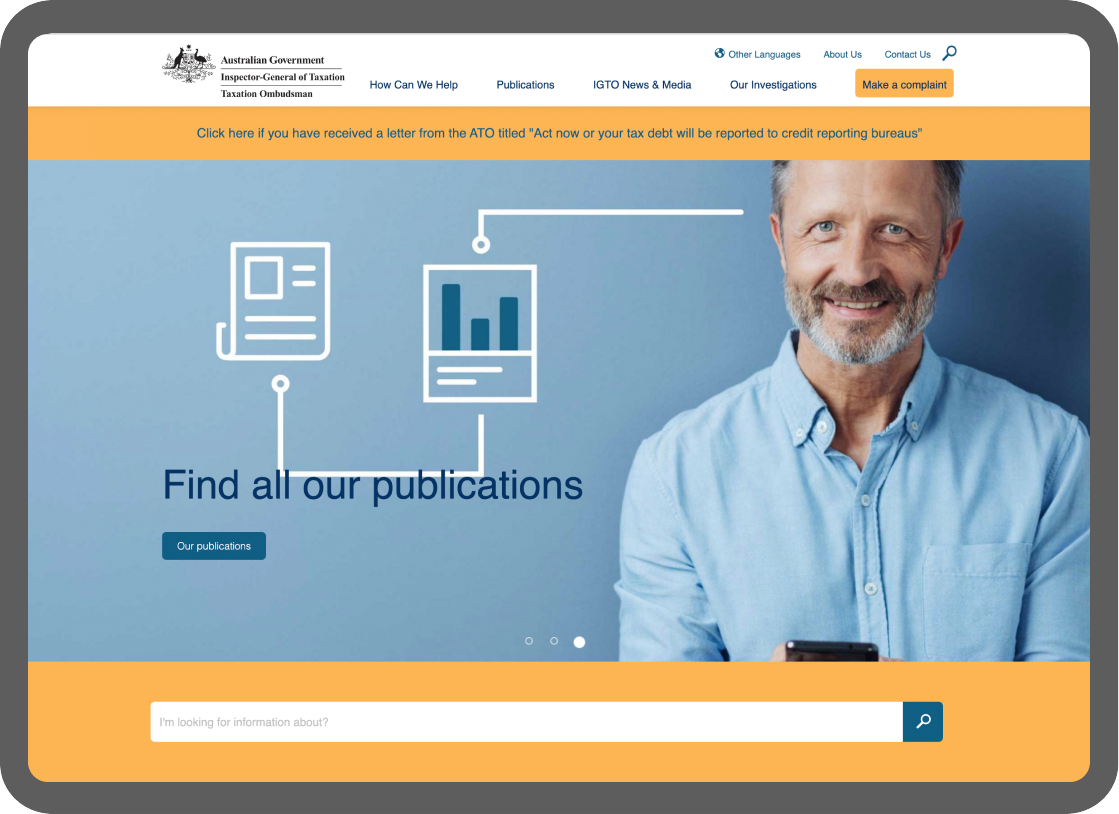
- Easily searching and referencing hosted historical information
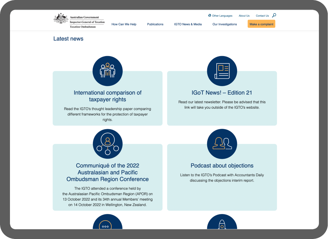
- Signing up to the IGTO newsletter to stay up to date with the release of the latest taxation information from the IGTO.

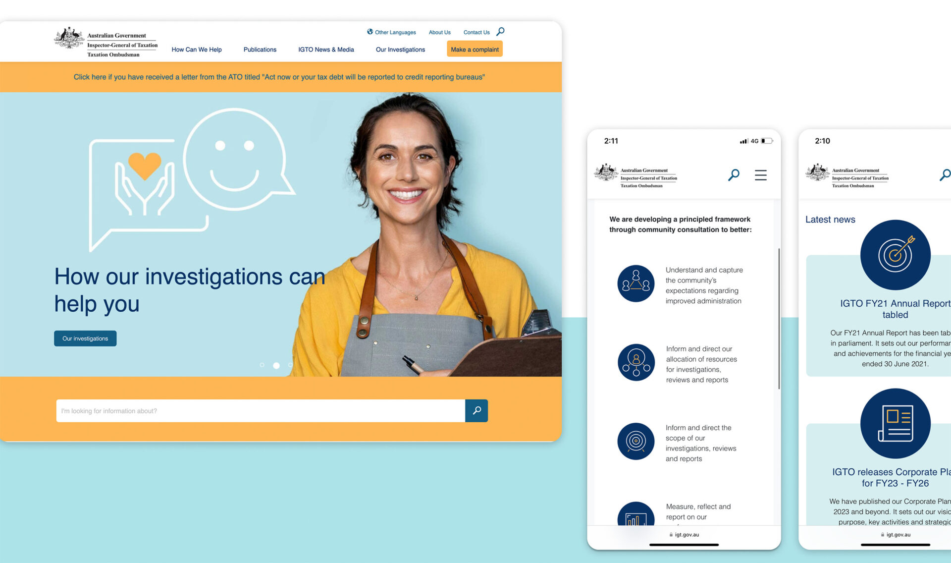
We developed a modern and very approachable visual aesthetic and significantly evolved the user experience design system that put the different users and their needs at the forefront.
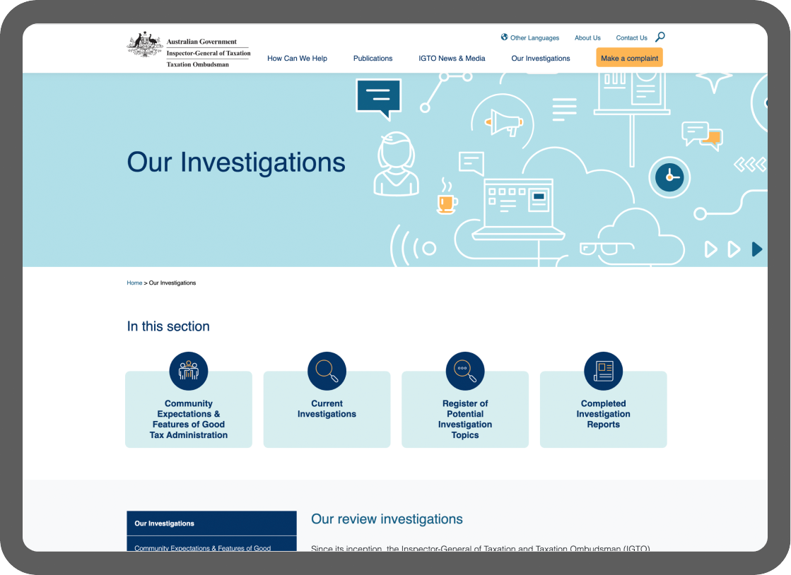
Overall strong visual design with good use of imagery and iconography was used to convey key messages without requiring text content to be read. New features such as a secondary side menu, the ability to filter search by keyword/categories/date, highlighted quick links for each section (containing a link and intro text for each sub-section) improved the user experience by providing quick and easy navigation throughout the website.
IGTOs deep knowledge bank was able to be brought to life and made much more accessible.

Outcomes
Since launch IGTO has seen an improvement in user feedback and it has assisted in pre-validating tax complaints as well as increasing the number of users who can self resolve their complaints via accessing existing documentation that is significantly easier to manage.

