Giving rise to a progressive allied health start up
What we delivered
- Naming
- Brand Strategy
- Brand Development
- Visual Design Identity
Challenge
In 2022, Sydney-based investment firm, Greenwich Capital Partners, co-invested with practice owners to roll up several privately-owned physiotherapy practices, bringing them together under one banner. The initial investment tranche included clinics from across New South Wales and in New Zealand.
Following the initial transactions, the emerging company set forth to develop a brand platform to establish its corporate life. The task included brand positioning, the creation of a new name and brand logo and the design of a visual identity system.
Whilst the acquired practices would retain their branding, for new clinics, the plan was to brand them using the newly created identity.
Aim
Key unifying insights uncovered during a stakeholder workshop confirmed the Group’s priority audiences and their needs, core values, tone-of-voice nuances, and most importantly, preferred positioning territories to guide the name development phase.
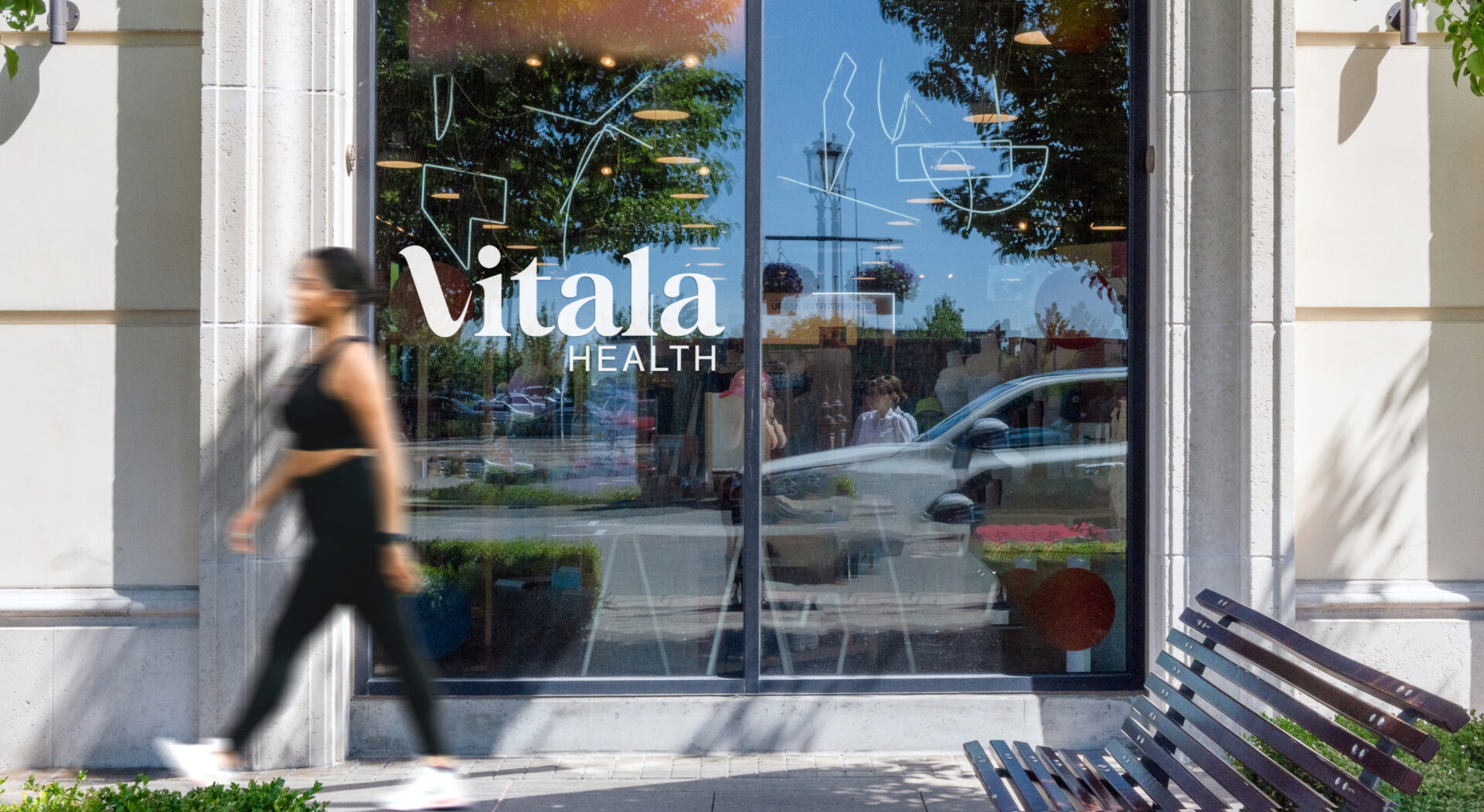
After an exhaustive name-creation process, Vitala Health was finally confirmed as the new corporate name. The name Vitala was selected due to its strong association with the words, vitality, vitalise and vital. To help establish a narrative for the new entity, a brand positioning expression was developed. The positioning articulation centred on the preferred territory, “Connected with world’s best practice” which encapsulated the company’s unique proposition, ethos, essence, and future aspirations.
Idea
Following a peer group review, it was evident that Vitala’s competitive landscape was populated with conservative, homogenised and unimaginative brands that all looked alike. With many peer groups using generic language and ubiquitous branding treatments, Vitala saw an opportunity to be more progressive with its branding to distinguish itself.
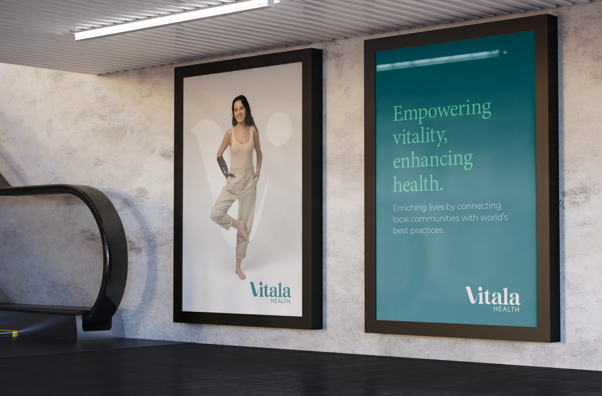
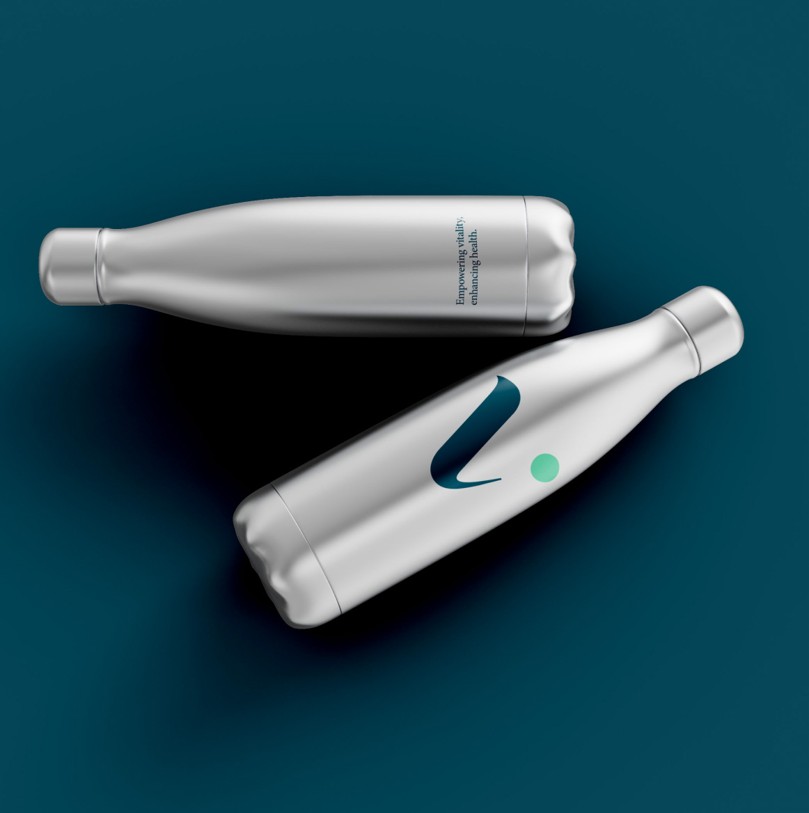
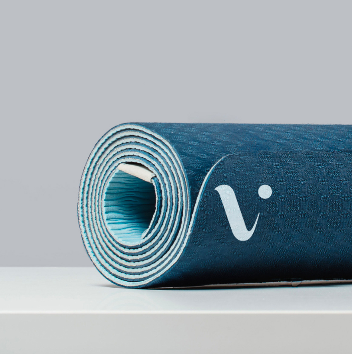
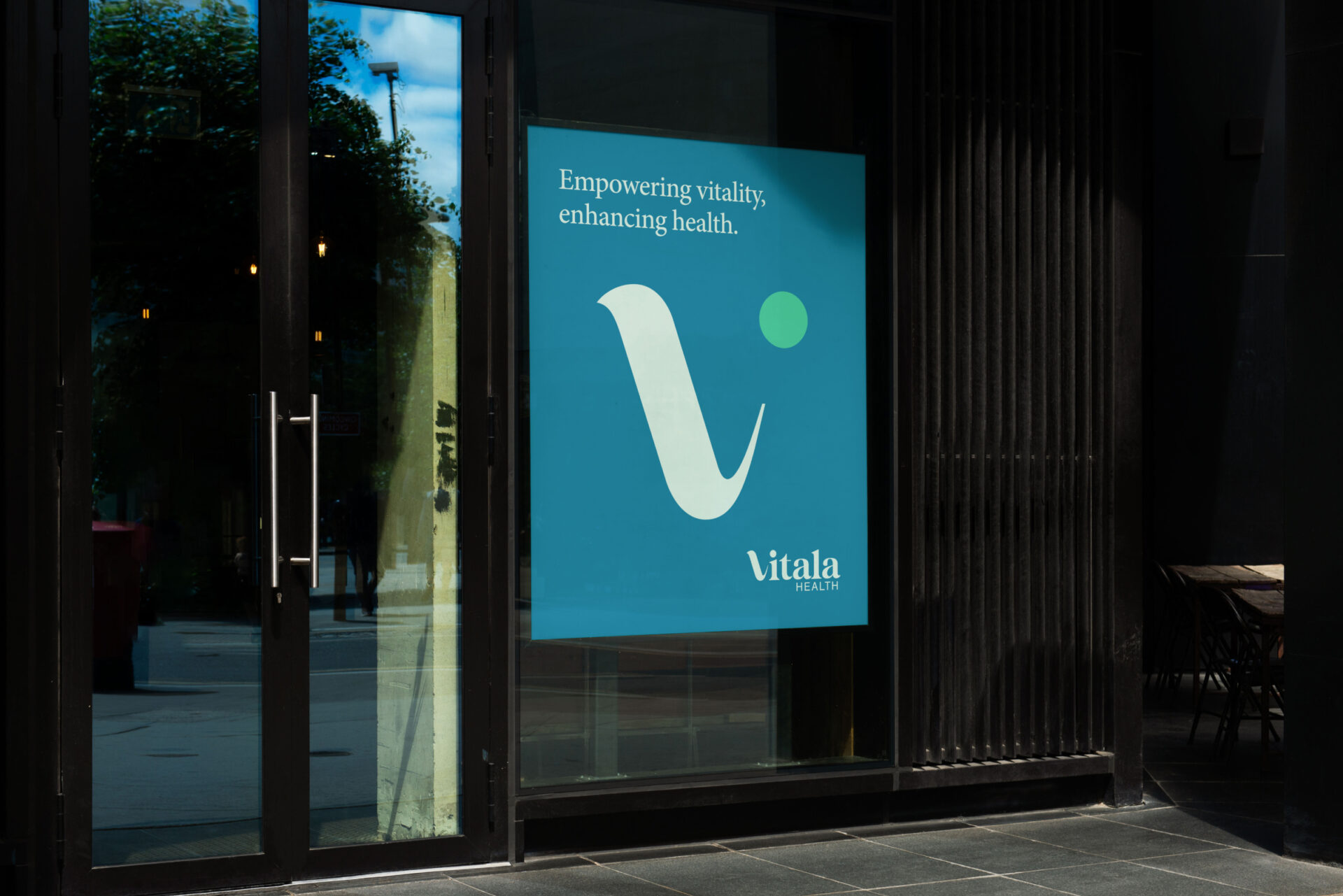
Vitala Health had a game-changing mindset. To reflect this, Collier Creative reimagined new and innovative ways to depict them visually. At the heart of the branding concept was a dynamic letter ‘V’ mnemonic device that was created to echo the fluid, flexible and agile forms of the human body. Combined with disruptive image treatments and a contemporary colour palette, the overall visual impact was progressive and more thought-provoking.
The dynamic identity approach recommended Collier Creative needed to create a visual identity system that was not fixed or static, but infinitely flexible and constantly evolving. Unlike traditional visual identities, dynamic identities are more fluid and can change over time depending on the context, environment, messaging or human experience.
By embedding a constantly evolving ‘V’ device into the identity system, Vitala’s branding became considerably more ownable, recognisable, and memorable.


Experience
On completion of the design phase, Vitala’s visual identity system was documented in a style guide. The comprehensive guidelines document informed the implementation phase as the new branding was applied across a range of critical business templates and social media channels. As a start-up, the roll-out is an ongoing work in progress.
Outcome
Vitala Health is a progressive group of renowned international allied health professionals. Their coming together under one unified brand, enabled all practitioners to become fully invested in the team’s collective passion to enrich lives by connecting local communities with world best practices.
