Growing
greater
together.
Growing
greater
together.
Making a good company great… a timely story
Challenge
Greenwich Capital Partners (Greenwich) is an alternative investment advisory firm that partners with ambitious companies to help them improve, grow and deliver stronger, long-term returns to the owners and/or investors.
Greenwich’s reputation for fostering strong partnerships, delivering returns and creating value has helped the business build a loyal clientele. However, as the market matured and became more competitive, the challenge to maintain its growth performance was intensified.
Greenwich identified that its market position’s uncertainty and a lack of awareness and clear differentiation had contributed to some of its challenges. These factors collectively formed a frustrating obstacle to the company’s commercial ambitions.
What we delivered
- Brand Strategy
- Brand Visual Identity
- Brand Refresh
- Corporate Stationery
- Web UX Design
- Website Development
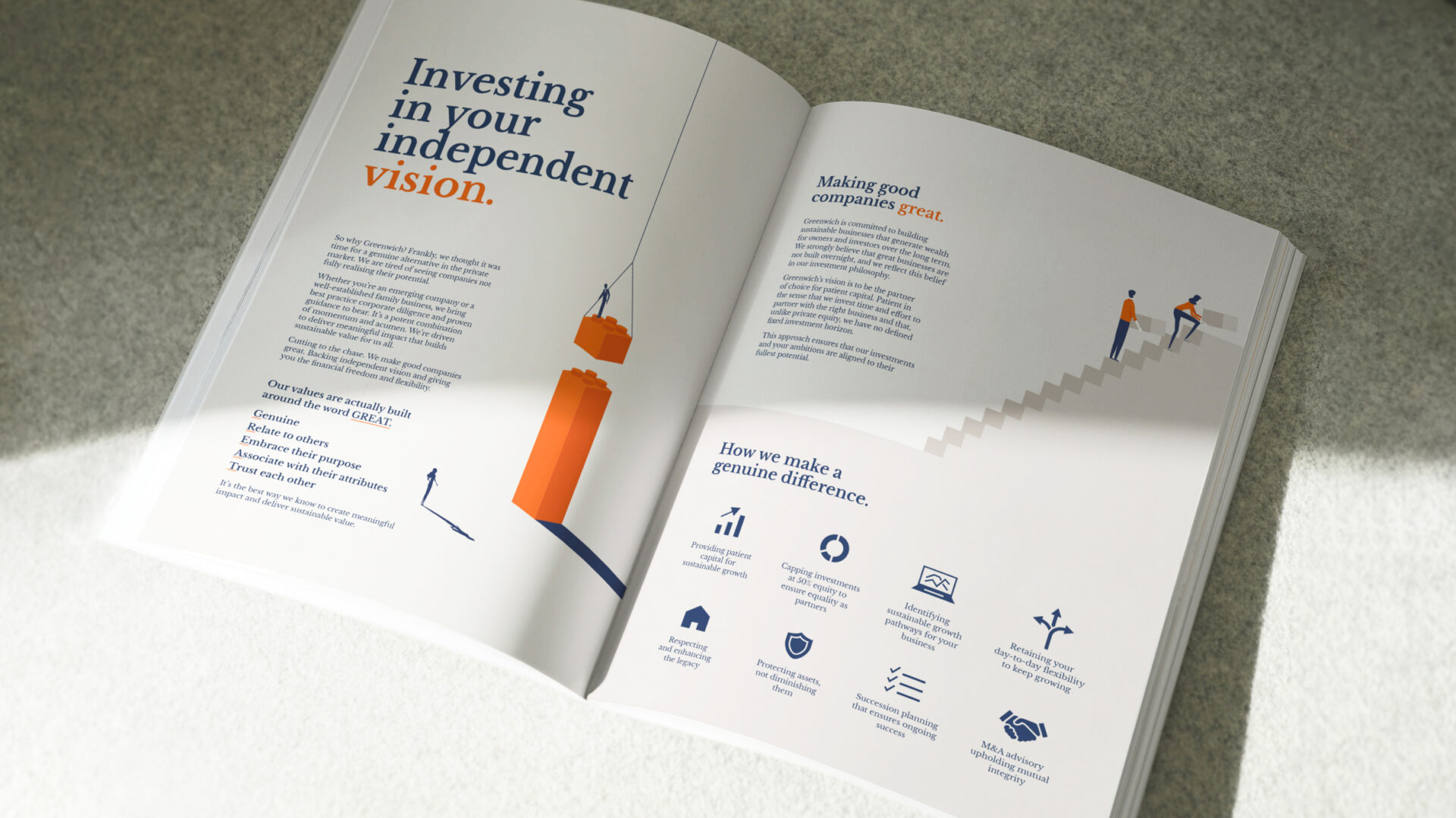
We make good companies great. Making independent vision and giving you the financial freedom and flexibility. Our values are actually built around the word GREAT.


Aim
To help address these concerns, a comprehensive branding brief was prepared that focused on developing a unique and compelling positioning platform and a new branding design.
Greenwich’s positioning challenges and aspirations were initially informed through a tailored questionnaire to senior management. Clarifying information gaps and conflicts was followed up through a strategic workshop. The unifying insights and potential positioning territories were tested and validated through a light-touch, client research program.
The positioning territory that resonated strongest centred on the notion of, “momentum with meaning” with the core message, “making good companies great” at the heart of the value proposition. A compelling lead proposition statement “Growing Greater Together” headed a potent repositioning articulation that succinctly captured the brand’s promise, purpose and position.
Idea
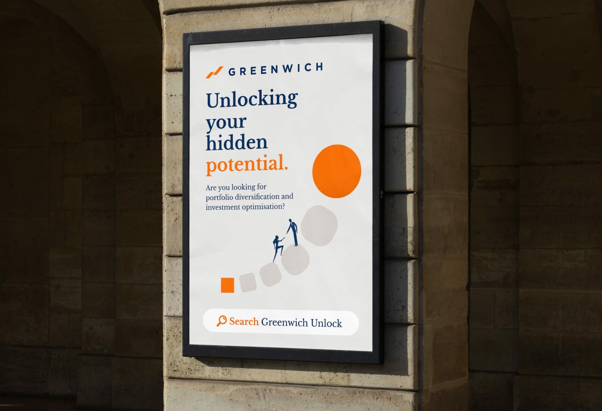
In a sea of sameness and cliched metropolis-styled photography, bringing Greenwich’s evolved positioning to life required a big, bold, branding idea. Inspired by simple illustrative metaphors, Greenwich’s evocative brand messages were conveyed with a strong sense of levity, honesty and positivity.
The concept emphasised and contrasted Greenwich’s fundamental market differences of patient investing, collaboration, and a true, value-add partner approach. It also accentuated the firm’s focus on driving business, financial and strategic performance.
The idea stripped away the noise and distractions to focus entirely on the fundamentals of success – growing together built on a trusted partnership. Combining simple illustrations with an uncluttered design aesthetic and bold pithy quotes, a unique, ultra-modern brand persona was created.
Greenwich’s branding idea led to the creation of a disruptive visual identity system, including a new brand logo which invited audiences to rethink the company and its services in a completely different light.
“…Collier provided actionable, creative and strategic recommendations for our brand refinement and communications evolution.”
ALAN LEE
Investment Director
Experience
Before the implementation of the new branding system, Greenwich requested the development of a detailed marketing plan.
The objective focused on building brand awareness and advocacy to generate quality leads. The plan emphasised the pivotal role the website would play as a communications hub to continually engage prospective clients in Greenwich’s compelling business proposition. With the tabling of the marketing plan, implementation of the new branding was rolled out across the organisation.
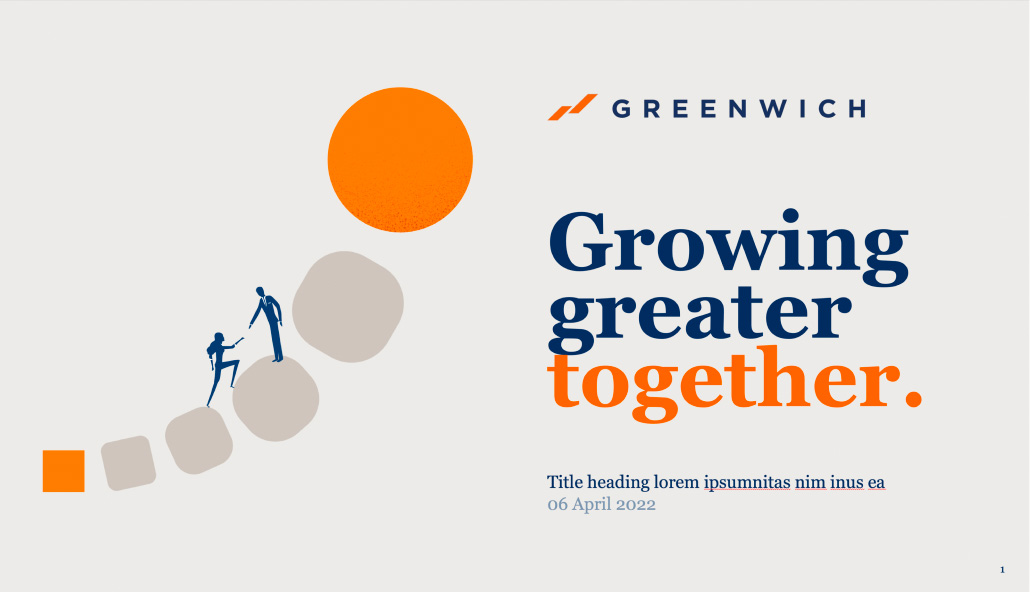
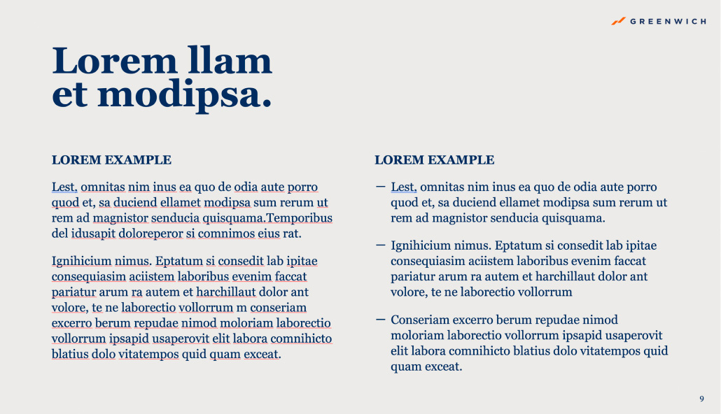
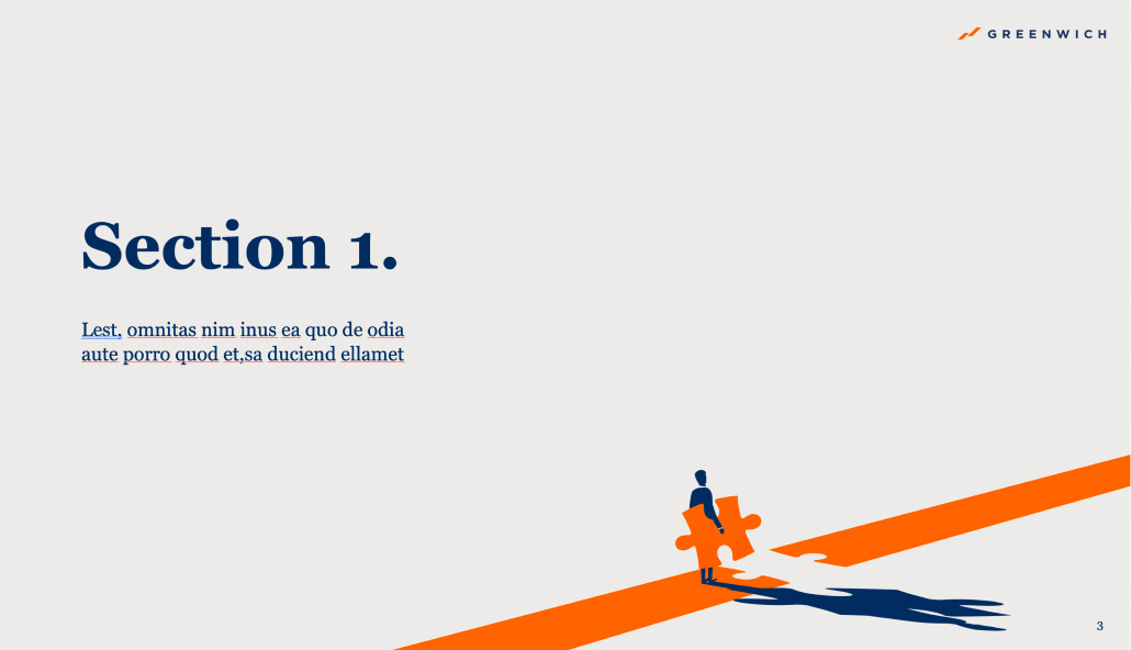
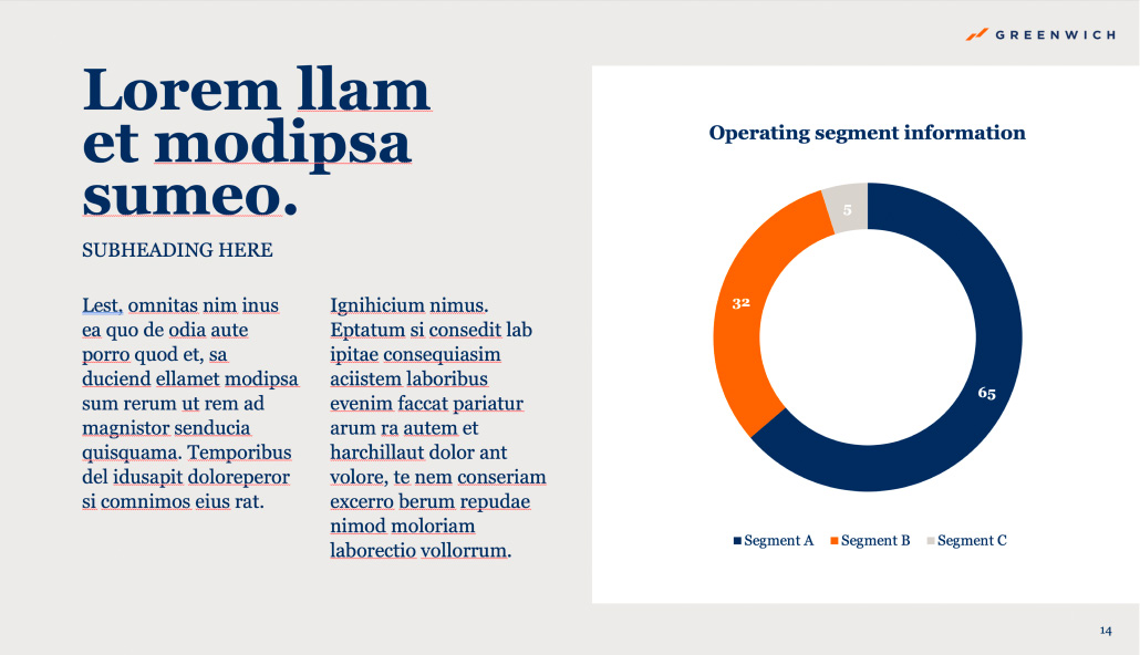
Key business documents such as presentation templates, sales collateral, email signatures and stationery items were all updated. Greenwich’s digital channels such as the company’s social media platform, LinkedIn and their website were also refreshed with the new brand look.
An informative style guide was developed to help guide the smooth roll-out of the branding system. The style guide provided valuable guidance for Greenwich’s marketing and communications team as they progressively updated their corporate templates.
Genuine, Relate to others, Embrace their purpose
Genuine, Relate to others, Embrace their purpose
Genuine, Relate to others, Embrace their purpose
Genuine, Relate to others, Embrace their purpose
Genuine, Relate to others, Embrace their purpose
Genuine, Relate to others, Embrace their purpose
Associate with their attributes, Trust each other
Associate with their attributes, Trust each other
Associate with their attributes, Trust each other
Associate with their attributes, Trust each other
Associate with their attributes, Trust each other
Associate with their attributes, Trust each other
Outcome
In February 2024, Greenwich’s website was relaunched heralding the official unveiling of the evolved positioning and the beginning of an exciting new chapter in the firm’s proud history.
In the conservative world of corporate advisory and investment, Greenwich’s new brand platform stood out as fresh and very different. Early reactions from both internal and external audiences indicate that the brand makeover and positioning evolution is a fresh change up from the previous branding.
Whilst it is still early days, what is evident is that Greenwich’s brand transformation has provided the company with a renewed sense of confidence and positivity as they execute their stakeholder engagement strategy in the coming months and years.
“…partnering with Collier has been a great experience. Their expertise in rebranding, market positioning, and website development has been instrumental in enhancing our presence in the industry.”
JONATHAN WARRAND
Managing Director
