On the radar and ready to grow
Challenge
Eaton Strategy & Search formerly Eaton Capital Partners, then ECP and now renamed as EATON, is a strategic advisory consultancy for the APAC legal services market. Following the demerger and the name change, the company began its journey with a basic branding toolkit to see it through its formative phase. After establishing the business foundations, the firm’s partners were ready to engage an external creative agency to help redefine the brand’s positioning to set the business up for future opportunities and growth.
The brand refresh program involved creating a compelling lead proposition and positioning, refreshing the visual identity system to reflect the brand’s personality, values and culture and redesigning the website to better engage visitors in the company’s evolved business story.


Aim
The core objective of the brand refresh was to position EATON as a distinctly different consultancy in a highly competitive legal services market. To help inform our thinking, a comprehensive review of the competitive landscape was undertaken to understand the market dynamics. The strategic opportunity that emerged centred around EATON’s pre-eminent legal advisory proposition for ambitious law firms.
Whilst the market was cluttered with a large number of international and local competitors who offered a broader range of services, it was EATON’s reputation for discreet, highly-focused, forward-thinking growth strategies that informed the final brand strategy.
Only those who will risk going
too far can possibly find out
how far one can go.
Only those who will risk going too far can possibly find out
how far one can go.
Growth is never by mere chance;
Growth is never by mere chance;
Growth is never by mere chance;
Growth is never by mere chance;
it is the result of forces working together.
it is the result of forces working together.
it is the result of forces working together.
it is the result of forces working together.
Idea
The core idea at the centre of EATON’s new identity design was ‘forward-thinking growth’. This concept aimed to reflect the firm’s renowned capabilities for innovative strategies for ambitious, growth-minded clients.
The core idea was reflected through a blend of contemporary, minimalist typography, thought-provoking quotations from eminent business people and a stripped-back colour palette combining a classic deep green, and a subtle sage with pops of fresh mint for contrast. The new sophisticated brand image stood out amongst the competitive set.
“Thanks to the brand refresh program we undertook with Collier Creative, Eaton has been able to redefine its market positioning to clearly differentiate the firm in the highly competitive, legal services sector.”
Shaaron Dalton, Partner
Experience
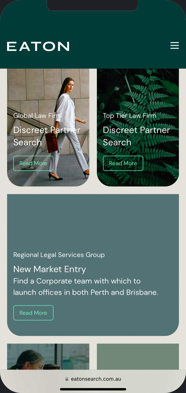
To promote and build awareness of EATON’s new proposition and business story, the first and most important communication touch point was the corporate website. The website strategy was designed to deliver an engaging and memorable user experience that would encourage visitors to subscribe for ongoing communications from the brand.


Growing your law firm?
Growing your law firm?
Growing your law firm?
Growing your law firm?
Realise what’s possible.
Realise what’s possible.
Realise what’s possible.
Realise what’s possible.
Outcome
EATON’s brand refresh program provided the company with a solid brand platform to communicate its distinctive service offerings in a more compelling way. For EATON, the refresh was the catalyst to attract and build stronger, personal relationships with its clients, prospective clients and candidates, resulting in a more confident outlook for its future growth ambitions.
“Next task was our website refresh, an important communication for prospective clients and candidates alike. The new site reflected the essence of our corporate story and our new branding, bringing it to life in an elegant and succinct manner.”
Shaaron Dalton, Partner


